

Case Study
10 Years of DAFT: Field Testing Our Interactive Mobile Projection Mapping Unit
June 8, 2026
DAFT 10 Years
When DAFT Studios celebrated their 10th anniversary, they wanted the party to spill outside. The brief was simple in spirit: take the gear that lives in their studio and bring it to life on the building itself.
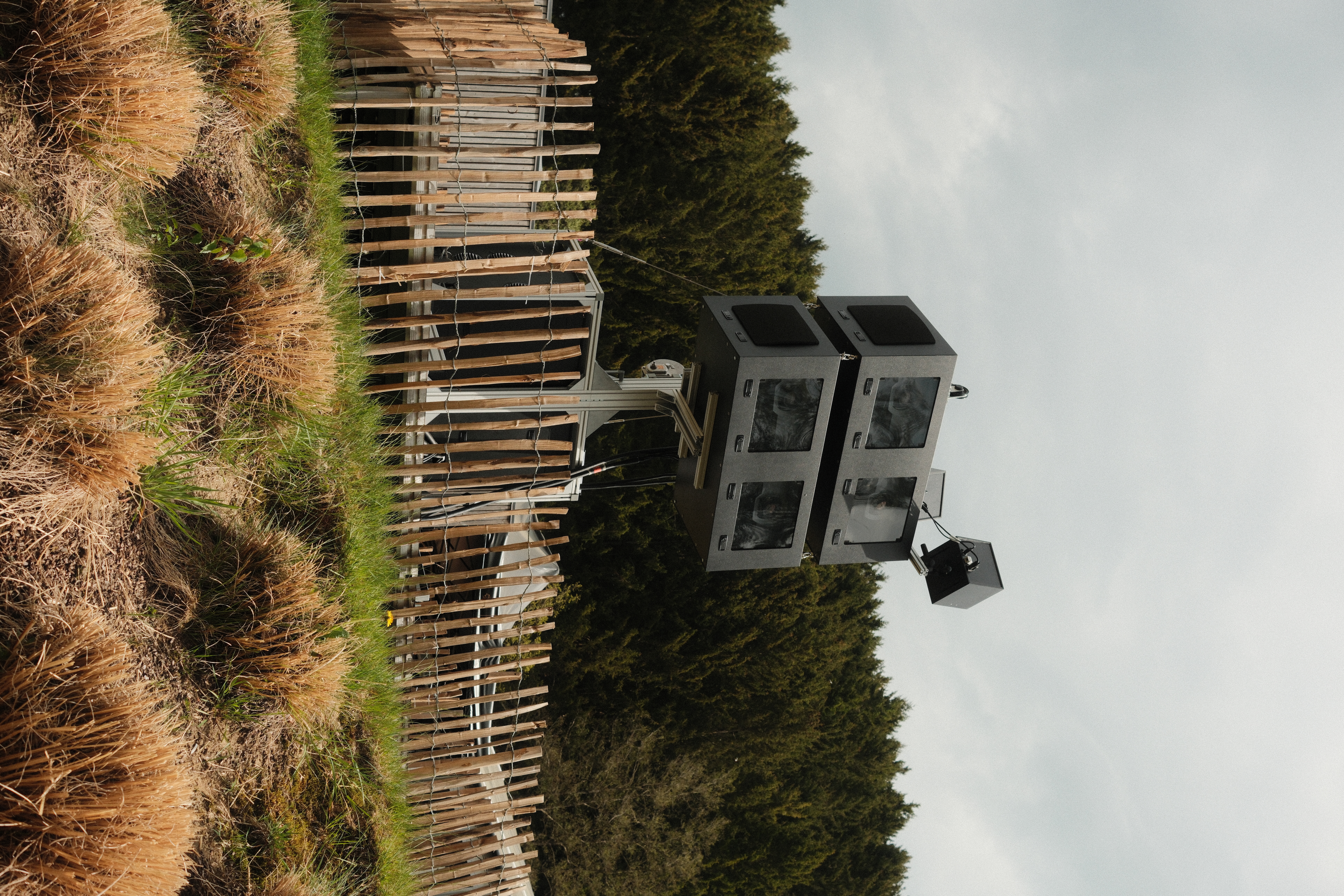
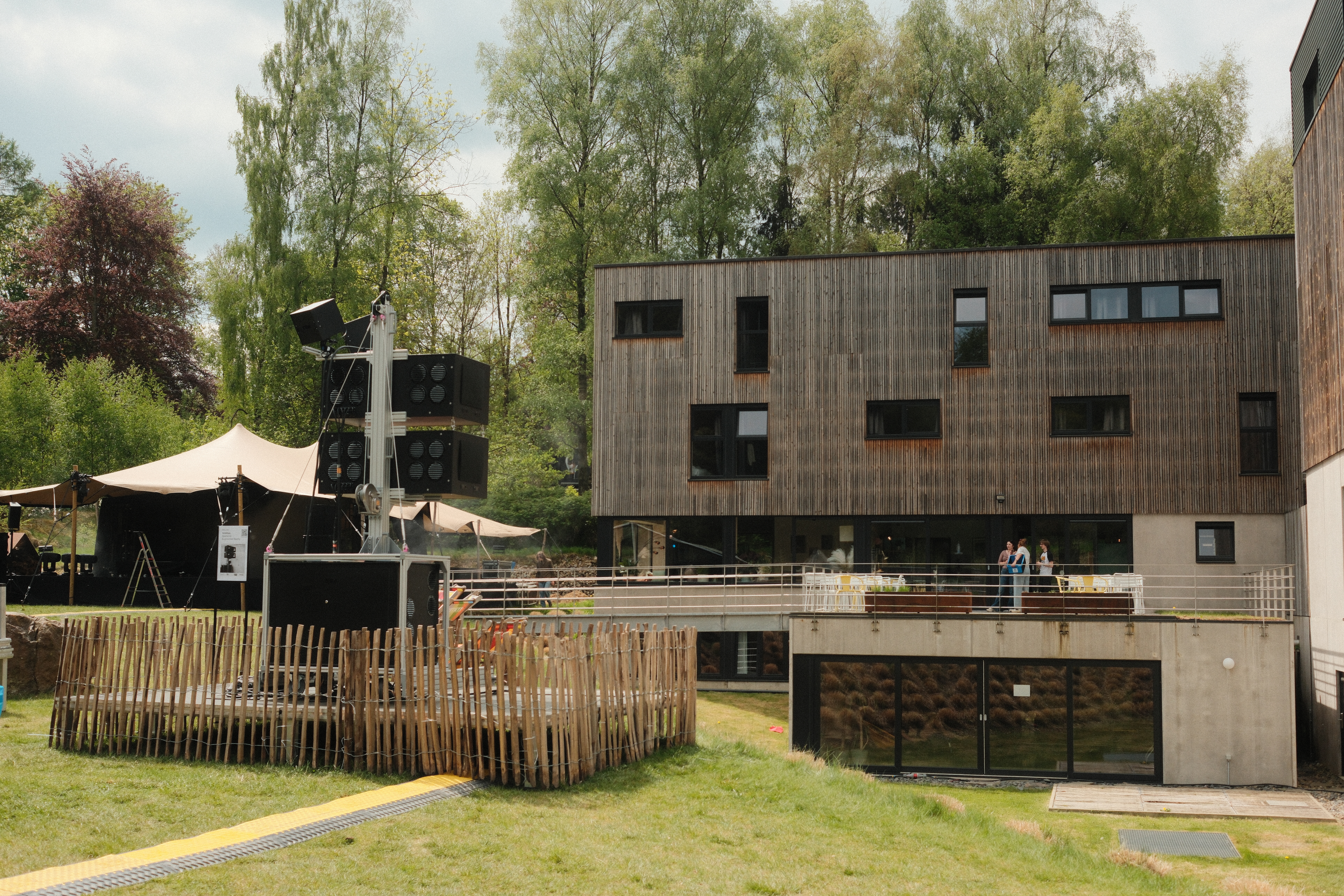
We'd been developing SAIARlab Infra, our modular infrastructure for large-scale projection work, and this felt like the right moment to put it through its paces in a real event context. The setup traveled in a trailer, was on-site and built within the hour, and was operational before the guests arrived. What follows is a breakdown of how we built the show.
Mapping the building from a photograph
One of the first challenges was that we couldn't visit the site before the event. We needed an accurate pixelmap of the building facade to base all our compositions on. Without one, any animation we'd create would be pure guesswork.
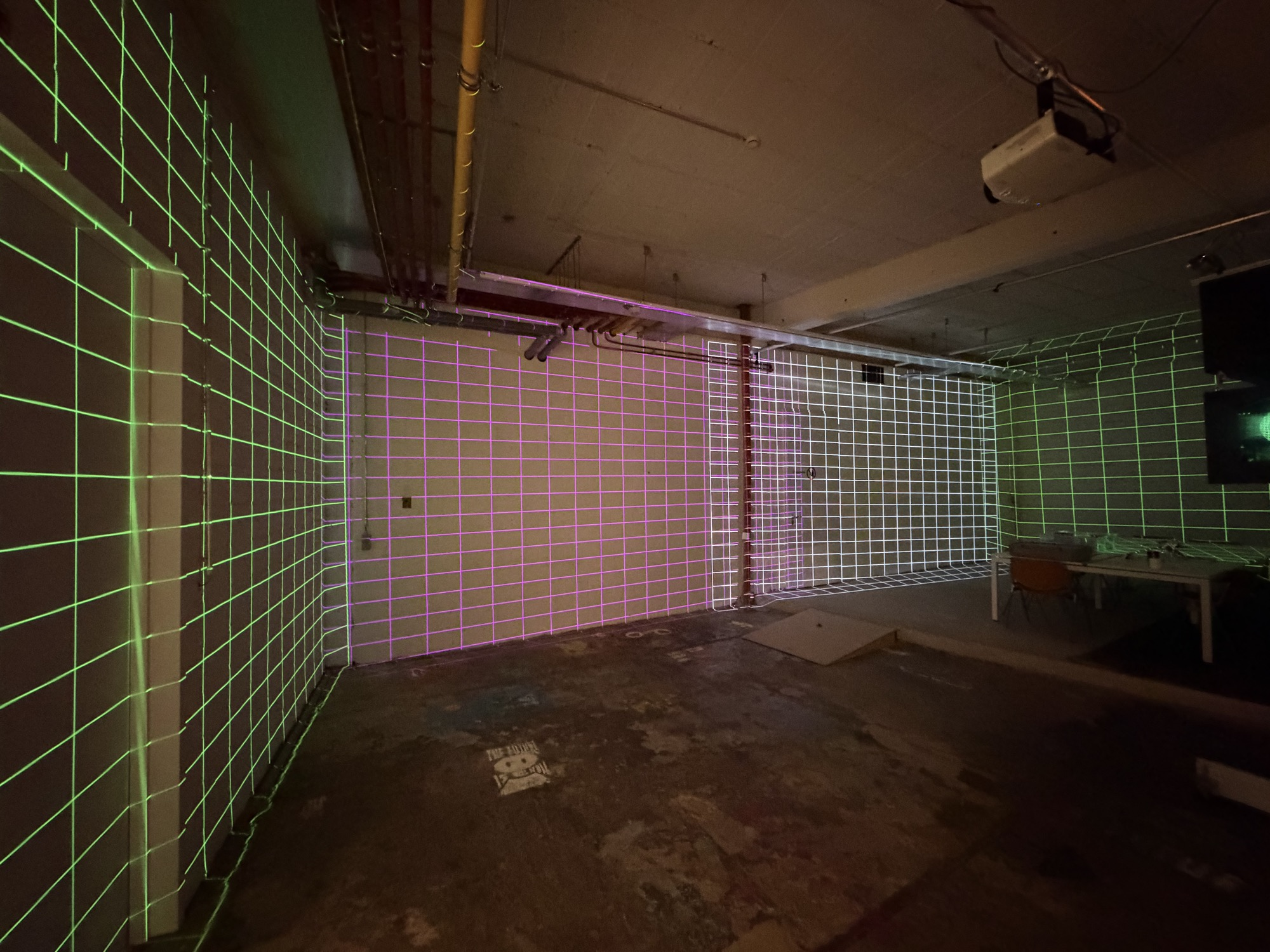
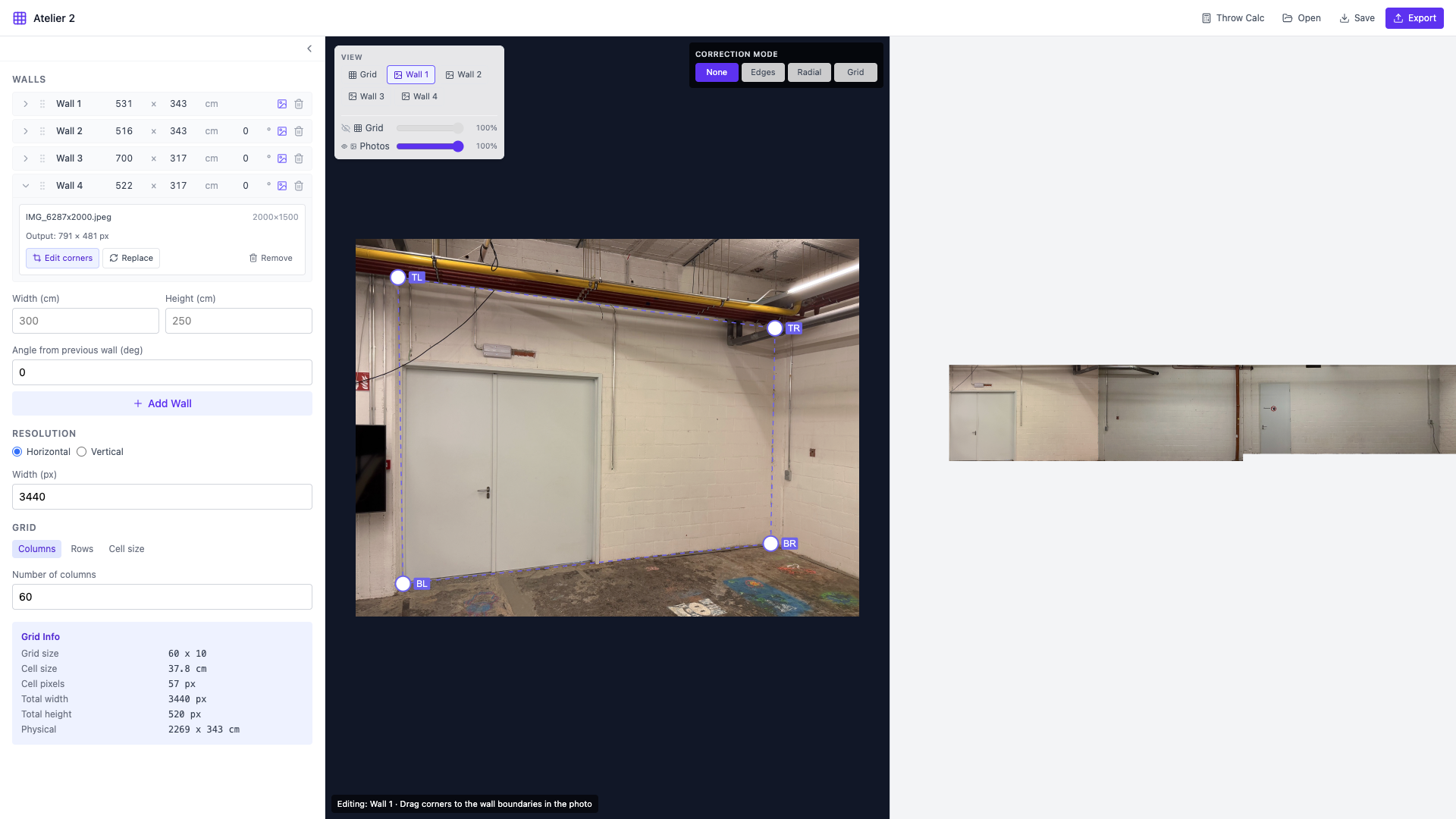
So we prototyped a small tool to solve exactly that: feed it a single photograph of a facade, and it produces a pixelmap alongside an alignment grid that we can use on-site to register the projectors quickly.
The tool is available at pixelmap.saiar.be, and we're actively developing it further. Multi-wall support is already in progress.

We are further developing this tool to be able to have multiple walls. A small preview:
Extending the visual language
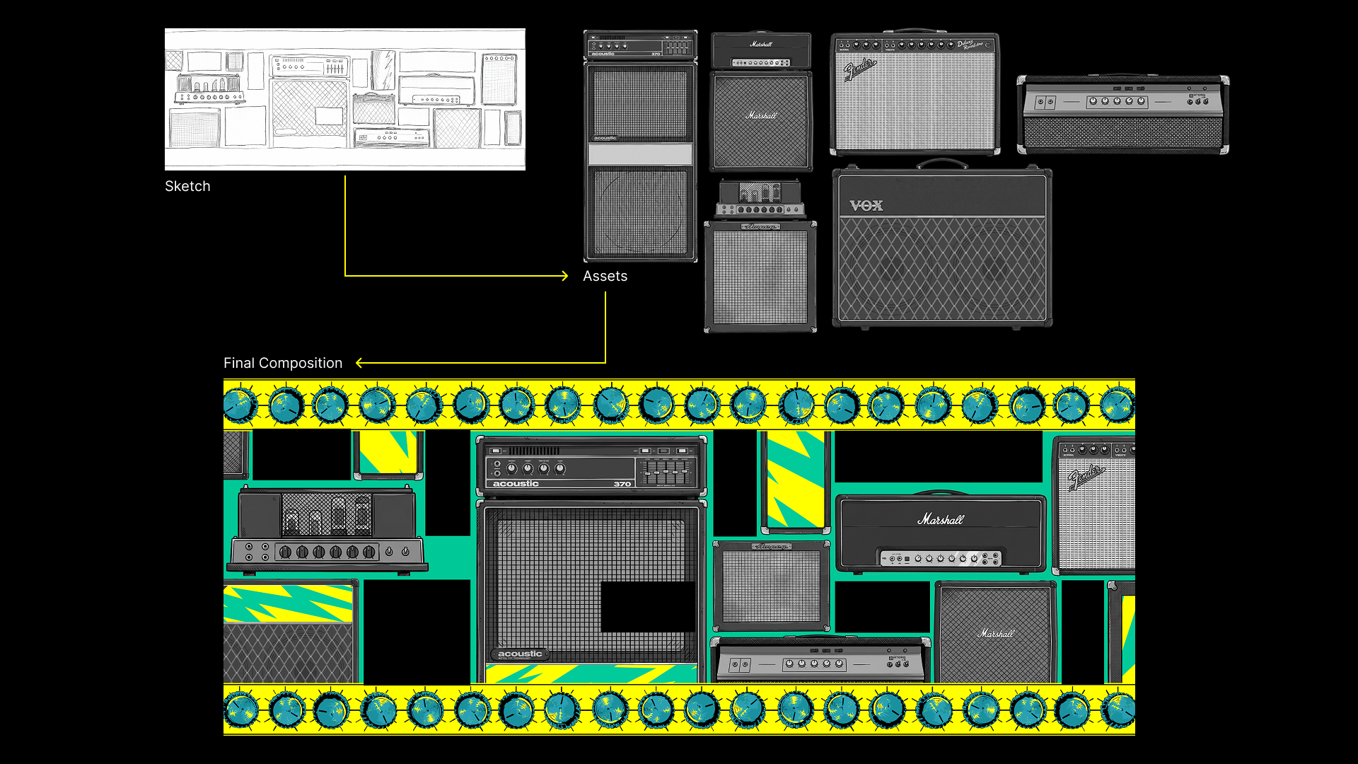
DAFT has a strong visual identity: a hand-drawn illustration style full of character, applied consistently across their branding. Some of their brand elements already existed as illustrations. Our job was to extend that language to a new set of objects and make everything move. DAFT gave us the green light to work this way, and the results held up well in context.
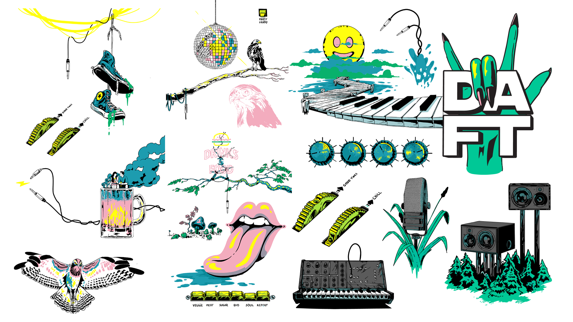
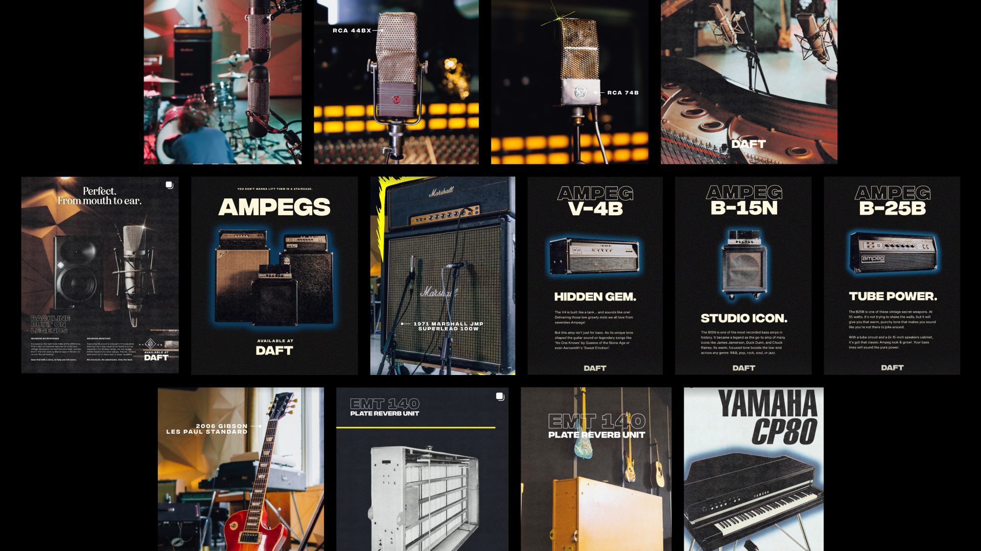
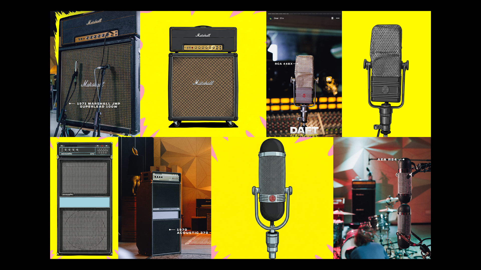
One detail we were particularly happy with: the dent in the upper-right microphone matches the actual dent in their real-life microphone. Bringing a personal touch to the illustrations.
In terms of composition, we worked from the building's pixelmap outward. Placing elements so they felt anchored to the architecture rather than floating in front of it.
Finding the seam between hand made and AI powered
With a tight turnaround, every animation decision was also a time decision. We’ve highlighted two small elements from the animation to highlight some of these decisions.
The disco ball is a good example. The traditional routes would definitely work, however, they would also be time consuming: model it in 3D software, paint the texture, animate the rotation and render; or use After Effects' CC Cylinder to wrap a 2D texture onto a sphere. Neither is particularly difficult, but both take time — and either way, you still need to paint a texture.
Instead, we placed the illustration on a bright background and fed it into our AI video workflow, then cleaned up the result in post. The same approach worked for the guitar plectrums.
The goal was a blend where the technique disappears. Not everything needs to be AI-assisted, and not everything benefits from being done by hand. Finding that line is an ongoing process for us, and we still actively figuring it out.
Giving the crowd something to control
We alternated the show between two modes: the pre-rendered animation reel, and a live interactive experience where the audience could directly influence what was projected on the building.
For the interactive scenes, we used two Orbbec depth cameras mounted in custom weatherproof enclosures. These are designed to clip onto the projection rig's frame and survive rain, which it did. The cameras tracked audience movement and fed it into a real-time particle system, letting people sculpt the projection with their bodies. For this we used TouchDesigner.
Using a custom built calibration process, we can align multiple camera feeds perfectly with just 2 clicks in TouchDesigner and a calibration board. This saves a lot of time when setting up an interactive experience where you want to cover a large interaction space.

Things we learned
We travelled 480km (back and forth) with our mobile equipment, and were able to set it up on location without too much of a hassle (ok, we’ll pack an extra allen wrench next time). The pixel-map aligned perfectly, and the light output of our projectors was great.
There was one hiccup though: when we did the initial mapping the night before the event, we used an external screen on the setup for ease of use. However, when we then tried to turn on the mapping the day of the event, via teamviewer, our mapping was messed up because of the missing physical screen and it was showing the MadMapper UI on the building. We did a quick fix on site, by reconnecting the screen, without the audience even noticing. After the event, we added an additional EDID lock on an external screen, so that we’ll always have a screen for the madmapper interface, separate from the projectors.
Video
Acknowledgements
We’d like to thank DAFT for providing us with the opportunity to test the SAIARlab Infra in real life.
If you’re interested in experimenting with the SAIARlab Infrastructure or think it can work for your own project?
Send us an email: saiar@devine.be
SAIAR & SAIARlab Infrastructure is part of the research by bachelor programme Digital Design & Development (Devine) at Howest Kortrijk. The project is supported by VLAIO.