
AI Workflow, Case Study, Projection Mapping
WONDER 2025: The City Hall as Canvas for AI-Infused Projection Mapping
November 1, 2025
Learn more about SAIAR and receive the mentioned workflow files when you sign up for our newsletter.
Join our community on slack to receive the latest information, share workflows and connect with like-minded creatives.
Case study: Wonder Festival
Part of the SAIAR lab Case Studies Series
The context
Each year, we organize a projection mapping week with the final-year students of Devine – Digital Design and Development. The results of this intensive project week are showcased throughout the Wonder Festival.
This week presented the perfect opportunity to test the workflows we had been researching and apply them in a real-world context, bridging experimentation with practical execution.
During WONDER 2025, the City Hall on the Grote Markt will be transformed every evening into a magical canvas filled with colorful visuals. Since 2017, Kortrijk has been part of the global UNESCO Creative Cities of Design network, where we share creative ideas and inspiration. The partner design cities inspired the final-year students of the bachelor’s program Devine–KASK at Howest in Kortrijk. Get ready to be amazed by a spectacular creative light show!
We’ve been experimenting with generative AI for these projections for a couple of years, with a first live test back in 2023. You can read more about this in a separate blog post.
Concept: Kortrijk as a UNESCO City of Design
We set out to spotlight Kortrijk’s identity as a UNESCO City of Design by drawing on its textile heritage, using flax and linen as the narrative thread of the projection. From blooming flax to interlacing threads, the visuals culminate in a series of tapestries, each highlighting one pillar of the quadruple helix: Education, Industry, Design and Art, and Urban Development, the collaborative ecosystem that underpins Kortrijk’s design excellence.
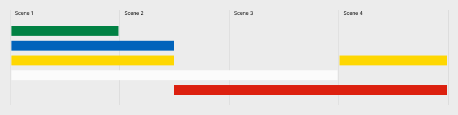
To keep the project achievable within a single week, we decided to focus on four key scenes and began exploring compositions through sketches and storyboards.
Storyboard
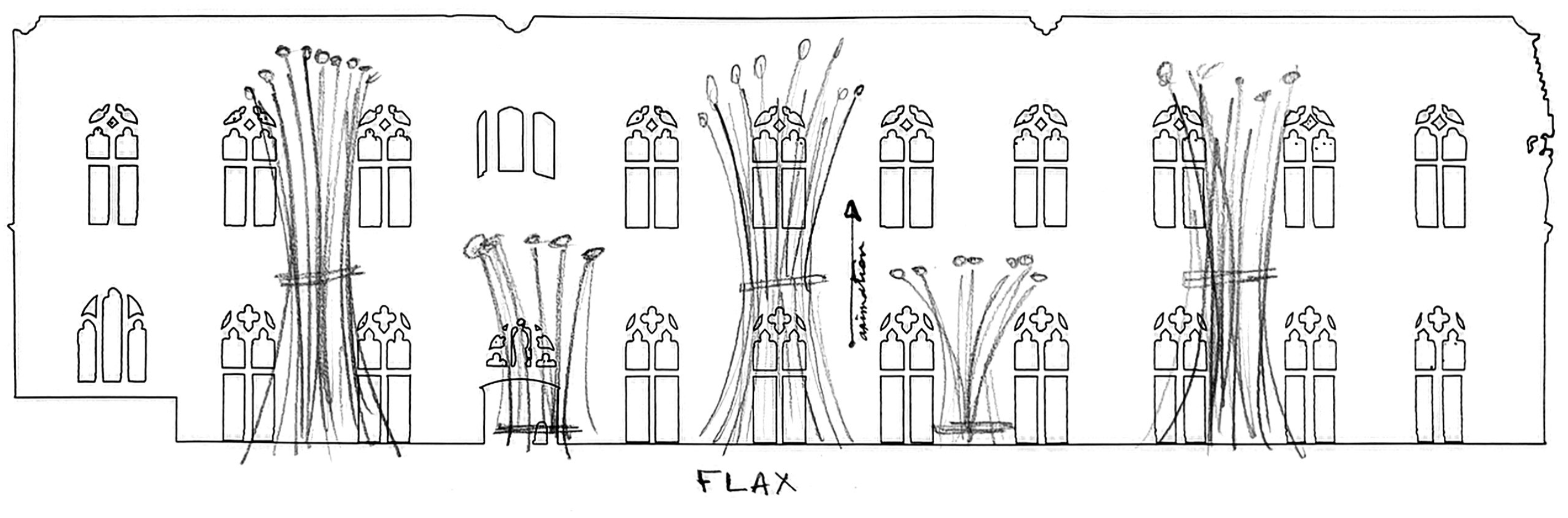
Flax flowers blooming
Flax bundles appearing in the field
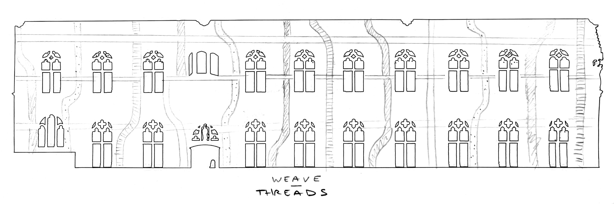
Threads weaving together
Final scene: multiple tapestries unfurl, each representing one element of the Quadruple Helix

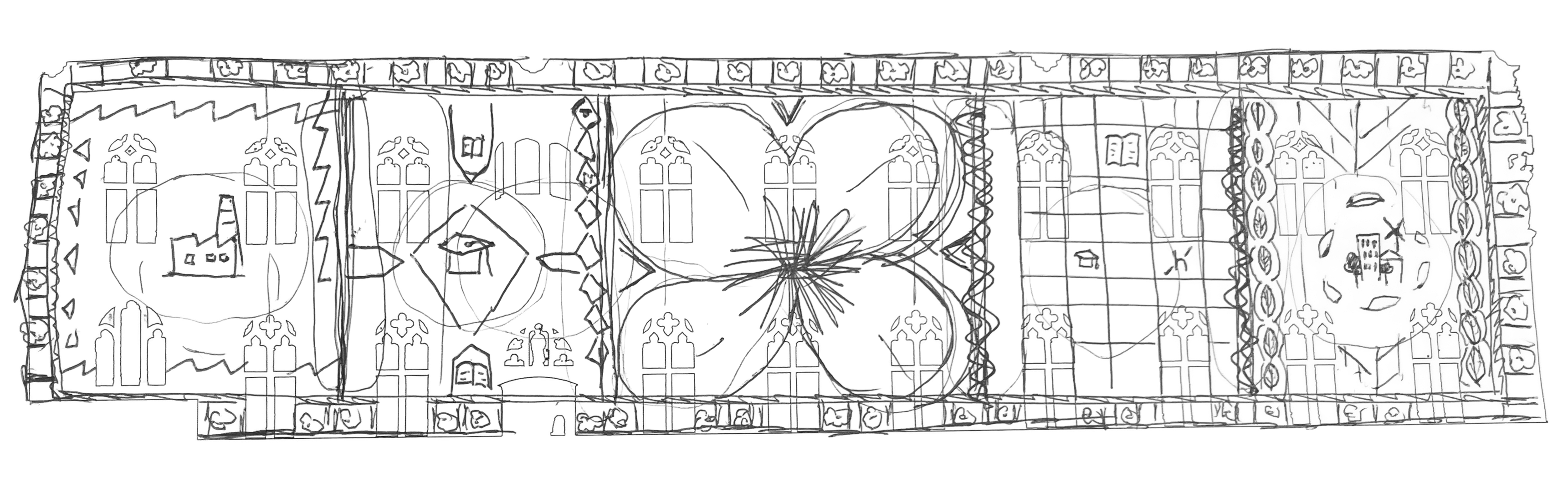
Each of the four peripheral tapestries features a central motif symbolizing one pillar of the Quadruple Helix:: Design & Arts (K-Totem, Kortrijk), Industry (Barco & Texture museum), Urban Development (the Collegebrug bicycle bridge), and Education (The Penta).
The city colors of Kortrijk, red and white, served as the foundation for our visual palette. We wove this color scheme throughout the animation, developing a color narrative that transitions from the greens and blues of the flax flower fields, to the gold hues of the “flax chapels”, and finally to the red and white fabrics that symbolize Kortrijk’s identity. The sequence culminates in rich red and gold textiles, drawing inspiration from traditional Damask weaving, which would contrast well on the building.
Preliminary technical research
At time of writing, the state-of-the art open source models were Qwen Image (for static images) and WAN (for animations).
Qwen Image
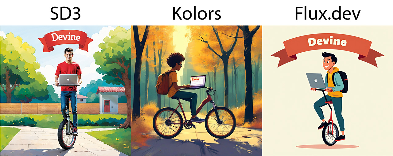
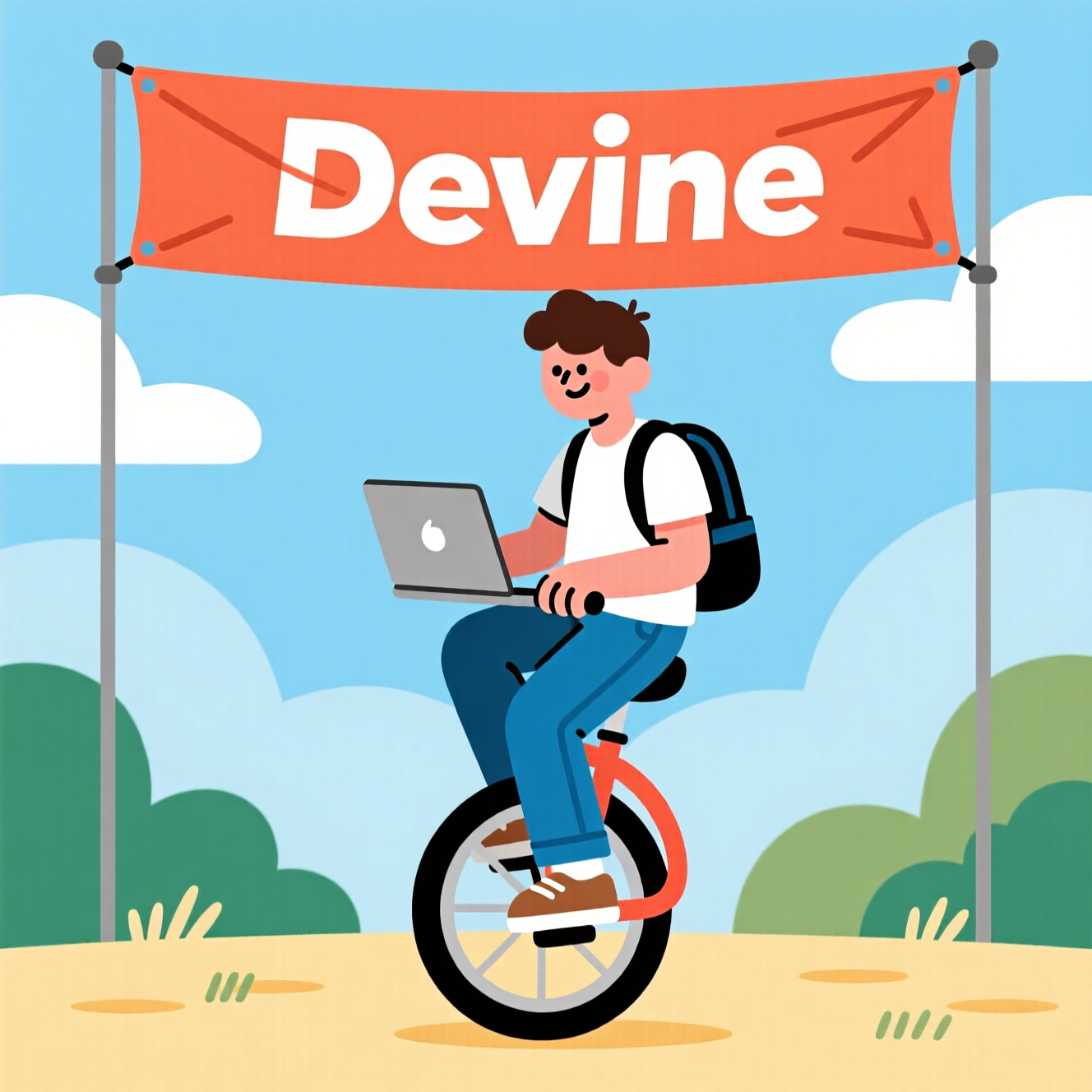
One of the go-to prompts we tested in the past was illustration of a student with a laptop on a unicycle, underneath a banner saying "Devine"
That prompt tests styling (illustration), objects (laptop, unicycle, banner), positioning (student on unicycle, underneath…) and typography (”Devine”).
A comparison of this prompt in some older models:
Qwen Image scores good on all of these criteria:
Controlling structure
We want more control than just text to images. A technique used in the past for this is called “controlnet”. These are dedicated models that do either canny-edge control, depth map control, body pose control, … There are no separate control net models per application for Qwen Image. Instead, there are multi-modal input options with variations of Qwen Image.
Qwen Image Union Control
One of ComfyUI’s demo templates is for Qwen Image Union Control. We tested this unified controlnet with a canny edge input.
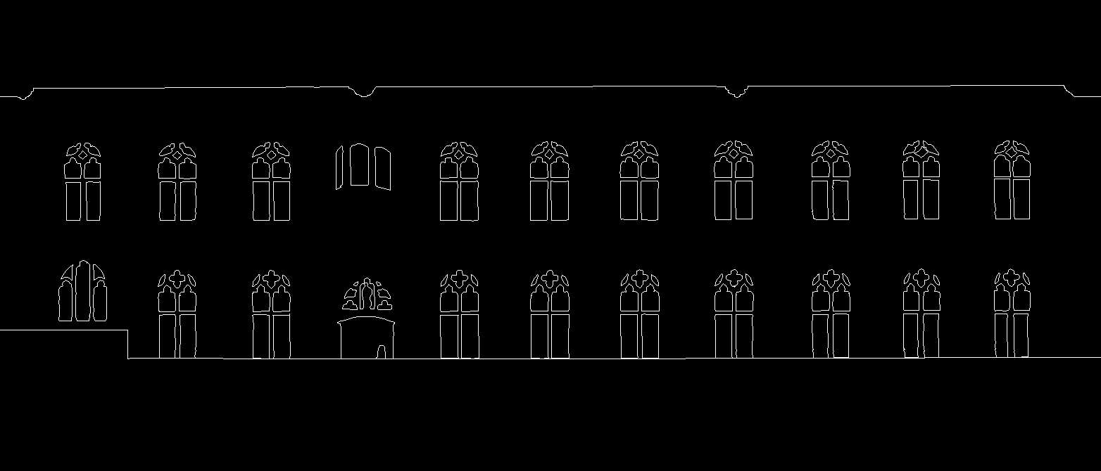
The text prompt was:
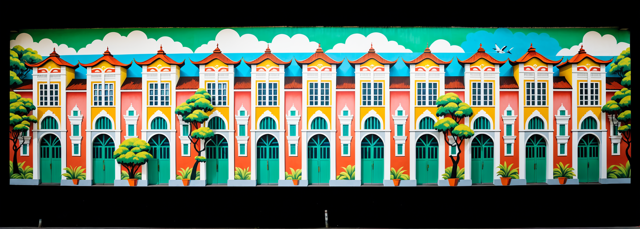
Bandung, Indonesia, Vibrant street art and colorful murals adorn colonial-era buildings amidst lush green landscapes, highlighting Bandung’s creative design community.
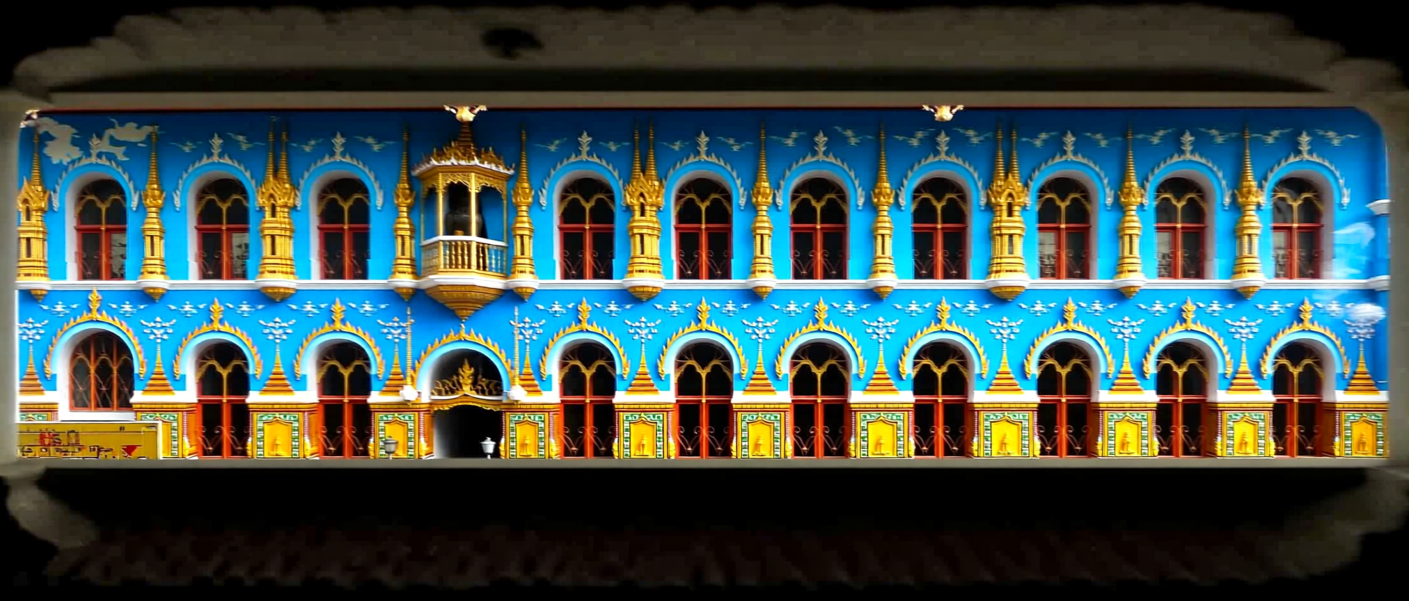
While this definitely follows the building structure, the Qwen model on itself is “less creative” than the older SDXL model. Our experience is that you need to have a more extensive description of every single thing you want to happen in the image, whereas SDXL hallucinates more, resulting in more surprising outputs.
Example of SDXL output with the same prompt:
We further explored the Qwen Image Edit 2509 as well, an “editing model”.
WAN Video 2.2
Wan Video 2.2 is an open source video model, released by Alibaba. It has different modes, such as text to video, image to video, speech to video and character replacement. It can generate 5 second videos in 720p resolution, and you can run it on consumer grade GPUs such as an RTX 4090.
Text + Image to Video
Using a photo of the city hall as an input, we can do pretty realistic simulations.
For example, using the prompt paint is dropping from the top of the building to the bottom until it covers the entire building resulted in the following video:
However, for projection, we shouldn’t really re-project the existing building onto the building. With a canny-edge input, WAN has enough context to work around building features such as the windows:
Colorful flowers start growing onto the building facade. They start at the bottom and work their way up. We evolve from an empty building to a full nature takeover, with butterflies and birds. No camera movement.
Upscaling
The final resolution we need for the city hall projection is 7300x2634. The current video is only 1536 × 416, so we need almost 5 times that resolution.
For our upscaling workflow file: Wan22_USDUA.json, please sign up for our newsletter
WAN 2.2 VACE
On September 16, WAN 2.2 VACE was released. It’s a derived WAN model that allows for controlling video with video. This way you can add some motion control.
While trying out different settings for the building, we found that using high motion contrast, with lots of movement and a low “end percentage” of the VACE control, generated the most visually interesting movements (input video at the top, output video on the bottom):
acryllic paint splashing onto a building facade, vibrant and colorful paint, with a variety of colors including red, orange, yellow, green, blue, and purple
To receive the VACE control workflow file wanvideo_22_Fun_A14B_VACE_testing.json, please consider joining our newsletter.
Start & End Frame
We got the best results out of start + end frame workflows. You can give the model a picture with the start frame, another picture of a desired end frame and let the AI model fill in the frames in between. This can generate decent animations with up to 121 frames natively.
One particular example we created was an illustration of a Dragon as a mural on the building:
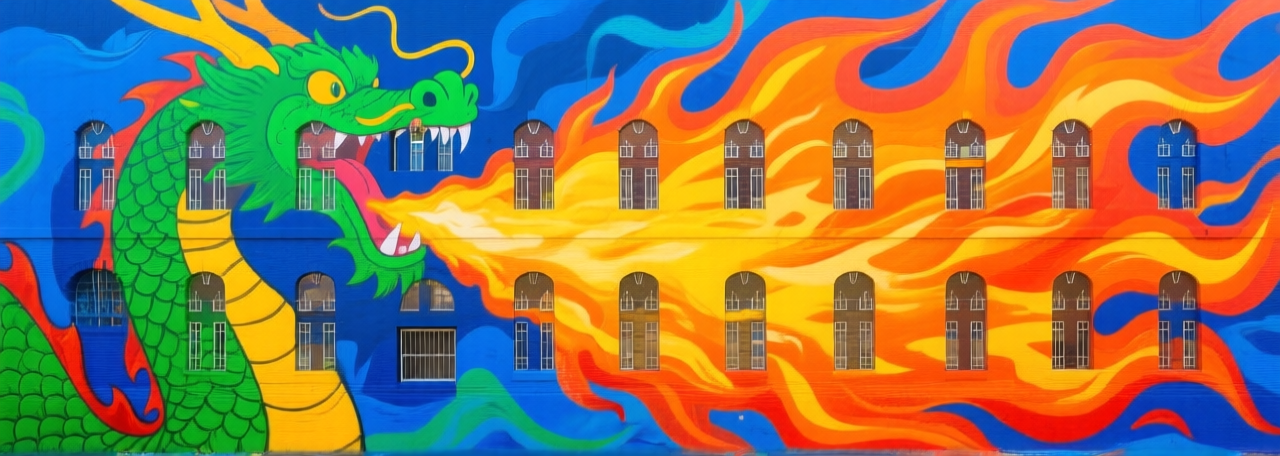
If we want this dragon to animate-in on the building, we can create a start frame where we remove the dragon, and let WAN figure out how to animate between then, using an additional text prompt:
Style transfer
When we want to create consistent graphics for the project, we’ll need to make sure that our compositions have a consistent style. One of the things we want to do at some point, is incorporating some of Kortrijk’s landmarks in the animation.
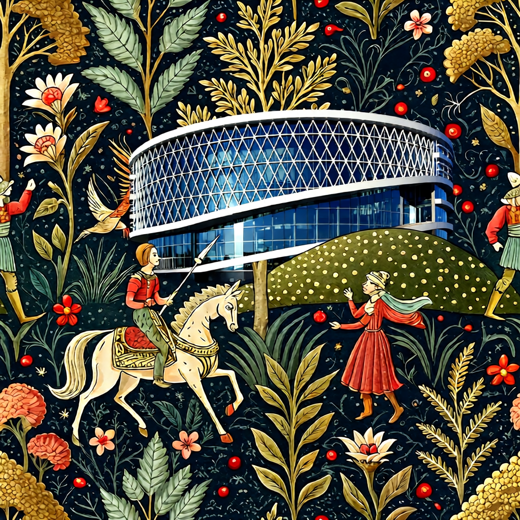
At this point in the research phase, we did not settle for a style yet, that’s why we went for a generic “medieval tapestry” style for the next test.
Can we incorporate the picture of a building into another composition, while fitting the style of the composition?
Using a picture of a medieval tapestry and a photo of the Barco building, we decided to do some tests. To explore this, we compared Qwen Image Edit, HiDream Image Edit, and the Nano Banana Photoshop Plugin.
Qwen Image Edit
HiDream Image Edit
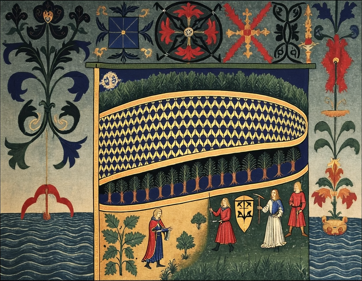
The results using these open-source models were not satisfactory. We were wondering how commercial models handle tasks like this.
Nano Banana (Google Gemini Flash Image)
Replace the castle in the tapestry with the building from the photo, make sure to use the style of the tapestry to draw the building.
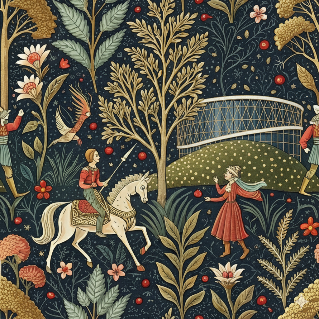
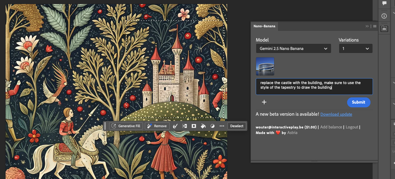
Nano Banana: The Photoshop Plugin
We selected the castle, prompted with the barco building photo and this text: replace the castle with the building, make sure to use the style of the tapestry to draw the building
Training a style LoRA
Another useful tool to get style consistency, is by using a style LoRA. You basically retrain some of the model layers with your own data to make sure a model is better in generating certain object, characters or styles.
We investigated the technique to train a style LoRA for Qwen Image.
As a first test, we trained a “medieval art” style LoRA locally on our RTX 4090, with AI Toolkit.
We gathered 40 images through Google Search, and captioned them.
Testing different training configurations
As an experiment, we wanted to try both long captions and short captions. For example:
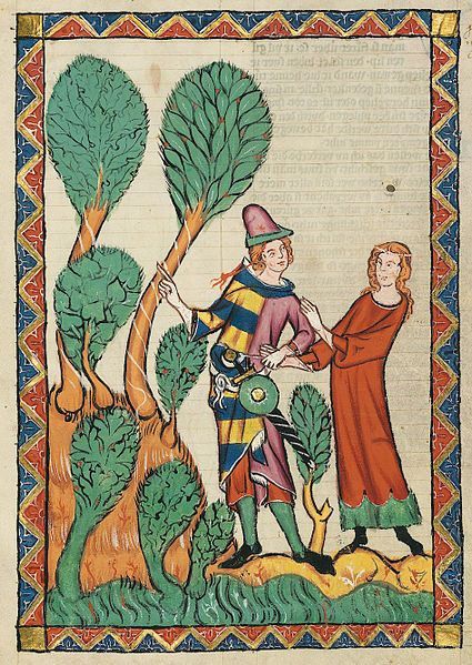
Long Caption: Two people stand near several trees. One person wears a hat, and a patterned shirt and pants. The other person wears a robe.
Short Caption: Two people in a field with trees.
Huggingface was running a “LoRA Frenzie” to promote their new jobs product. Which came at an ideal time for our research: we were able to use A100 GPUs for free for a week:
We ran different training configurations for the medieval art dataset, both on our local GPU (with it’s limitations) and on huggingface:
Comparing the results
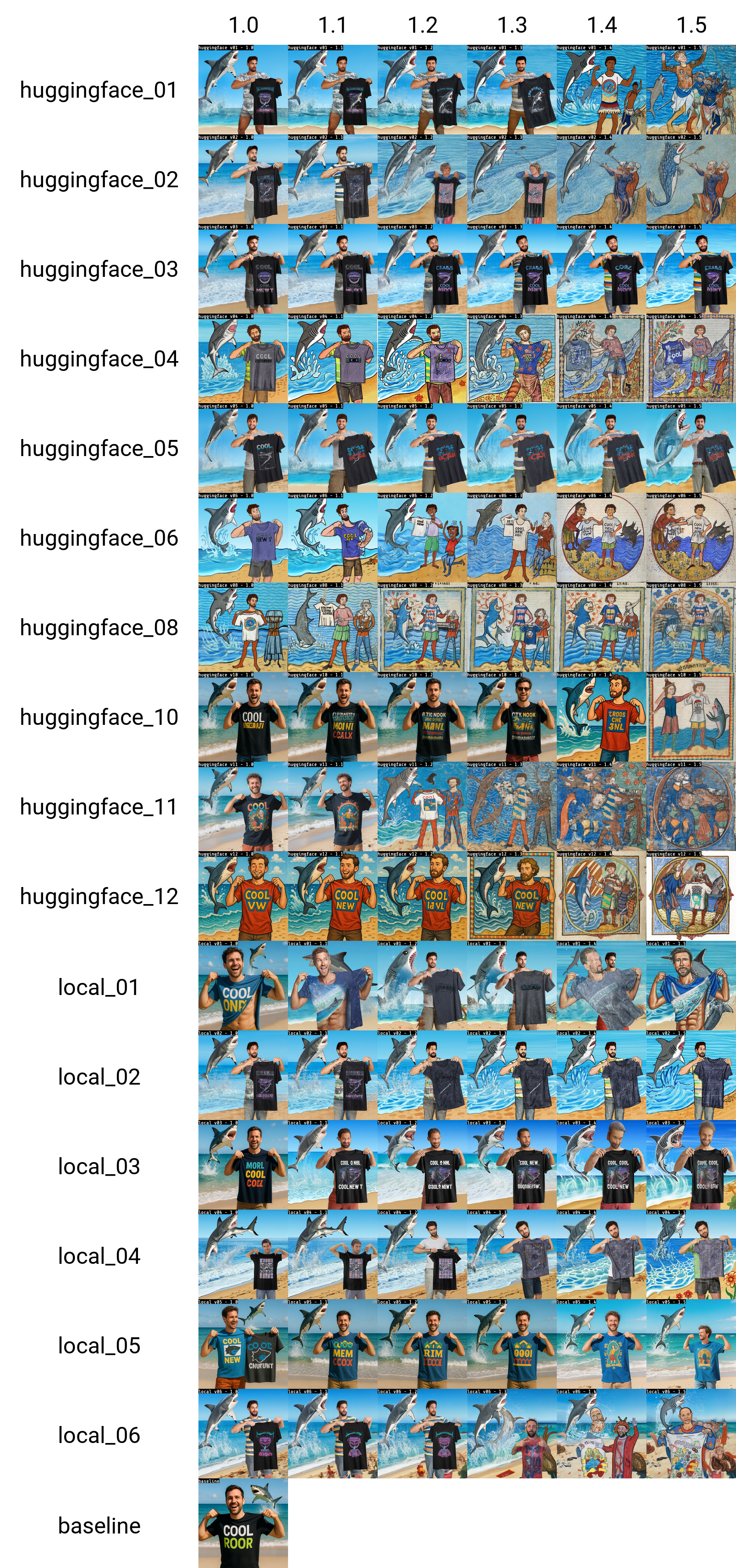
We tested each of these LoRA’s at different LoRA strengths (1.0 - 1.5) using a test prompt.
To receive the workflow file: workflow_lora_test.json, please consider joining our newsletter.
The baseline image in each grid, is how the image would look without the LoRA applied.
a man showing off his cool new t shirt at the beach, a shark is jumping out of the water in the background
We tried the following prompts as well:
a bear building a log cabin in the snow covered mountains
a bulldog, in a post apocalyptic world, with a shotgun, in a leather jacket, in a desert, with a motorcycle
woman with red hair, playing chess at the park, bomb going off in the background
a woman holding a coffee cup, in a beanie, sitting at a cafe
woman playing the guitar, on stage, singing a song, laser lights, punk rocker
a man holding a sign that says, 'this is a sign'
hipster man with a beard, building a chair, in a wood shop
Analyzing the results
I then looked at all results, and wrote down at what LoRA strength I was convinced about the style transfer (a zero means the LoRA did not work):
I applied the following scoring to these results:
10 pts: style ok at strength 1.0
9 pts: style ok at strength 1.1
8 pts: style ok at strength 1.2
7 pts: style ok at strength 1.3
6 pts: style ok at strength 1.4
5 pts: style ok at strength 1.5
0 pts: style never ok
This gives us the following ranking (max score would be 80):
1st place: huggingface_08: 78/80
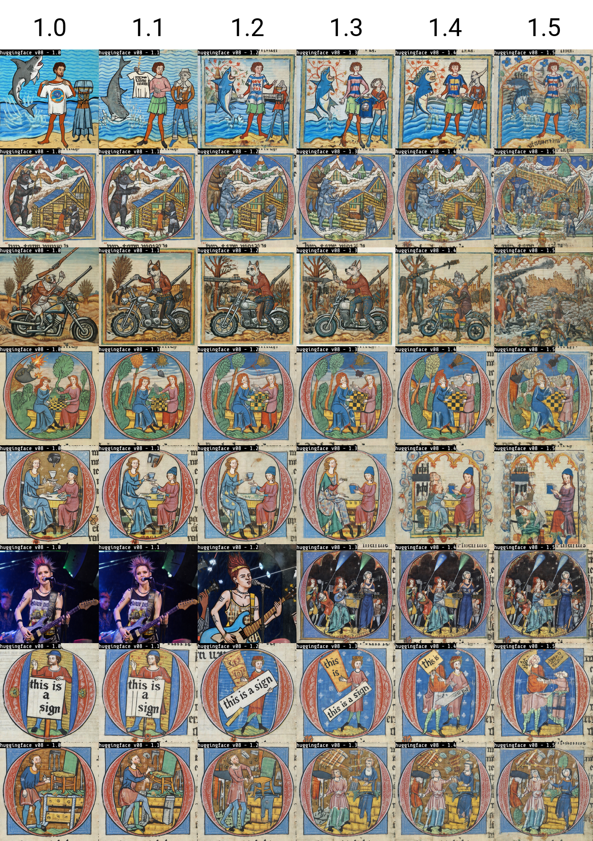
Looking at the grid of just this LoRA, it looks like it is a bit overtrained on the “drawing-inside-a-letter-O”. 5000 steps might be a little too long!
Huggingface 08 at 4500 steps - 71/80
Luckely, we have some snapshots during training. We tried the checkpoint at 4500 steps (instead of the 5000 steps of the final checkpoint)
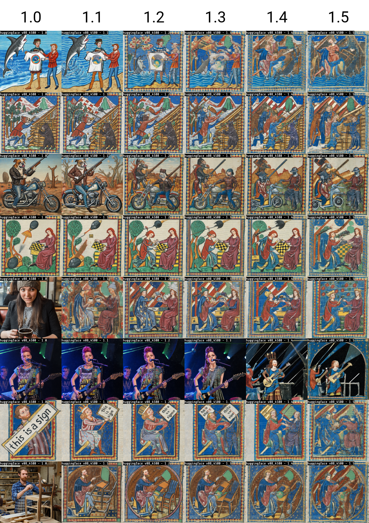
this one lands at 71/80 - all prompts are successful at some point, it picked up some sort of image frame with diamond shapes as a style. We might actually prefer this one over the 5000 step version, as it looks a bit more diverse.
Training a Qwen Image LoRA for our desired style
By this time in the project, we decided that we wanted to go for some sort of textile art / embroidery style. We gathered sample images and captions, such as this one:
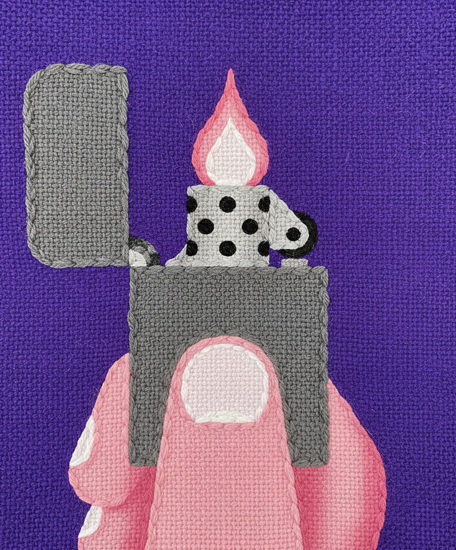
A hand holding an open lighter with a visible flame.
… and created a style LoRA on huggingface based on our earlier findings.
We got some pretty nice results out of it, for example
a man showing off his cool new t shirt at the beach, a shark is jumping out of the water in the background

The full LoRA grid with the test prompts also looked very promising.
Training a Qwen Image Edit LoRA
As the Qwen Image Edit model is a different model, you need to create a separate LoRA if you want to be able to do work with that model.
As a dataset, you need to provide the LoRA trainer with before / after images.
We already had a dataset of textile art pieces, so what we did wat convert those images back to “photorealistic” by using a two-step proces:
Convert the textile art to flat illustrations using nano banana
Convert the flat illustrations to photorealistic images using nano banana
We ended up with a dataset of 21 of these pairs.
Training Qwen Image Edit 2509 did not work, because of a bug in the ai-toolkit trainer.
We were able to train the “older” Qwen Image Edit model, using a Learning Rate of 0,0003 and 5000 steps at rank 32.
However, the results were not very spectacular.
For example, transforming the photo of the Barco building into a woven fabric:
Input Image
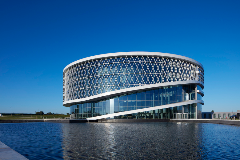
Without our LoRA
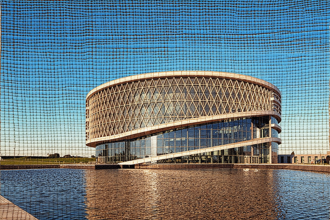
With our LoRA (strength 1.5)
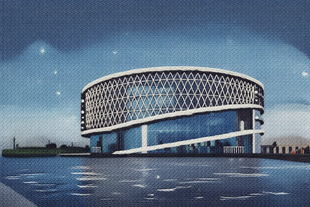
The LoRA definately has an impact. At LoRA strength 1.5 it looks like it is going in the right direction, but higher than that and the image starts to collapse. It seems like we need longer training to get decent results.
It looks like training a Qwen Image Edit LoRA takes longer (needs more steps) than a “general” Qwen Image LoRA.
An alternative approach to directing Qwen Image with a LoRA and image input
If we want to do image-to-image AND use our style LoRA, we can use the qwen_image_union_control LoRA as some sort of alternative to Qwen Image Edit. Using some captioning in combination with a Canny Edge version of a picture, can result in results where we have both control over the composition and style:

Our two workflows for applying styles
We ended up with two workflows to generate static assets for the project. They work in combination with the lightning LoRA too - so we can generate images in just 4 steps.
To receive the workflow file: qwen_image_woven_fabric_img2img.json, please consider joining our newsletter.
Animations using our style
We didn’t want to “generate” the entire building animation in one go, as a final result. In order to keep control over the motion, and maintain a high quality, we went for the start + end frame approach.
Model tests
Before we kicked off production, we decided to test a couple of commercial models as well, using a black start frame, and this end frame:
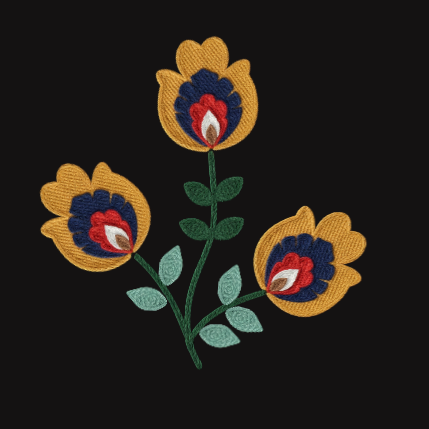
RunwayML
Kling Video AI

Luma AI
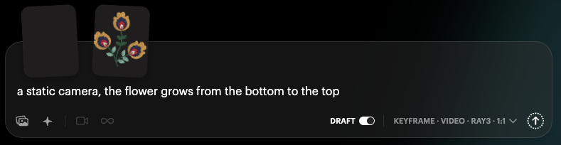
Result:
Luma AI’s result was pretty good and we decided to do one more tryout with a larger scene:
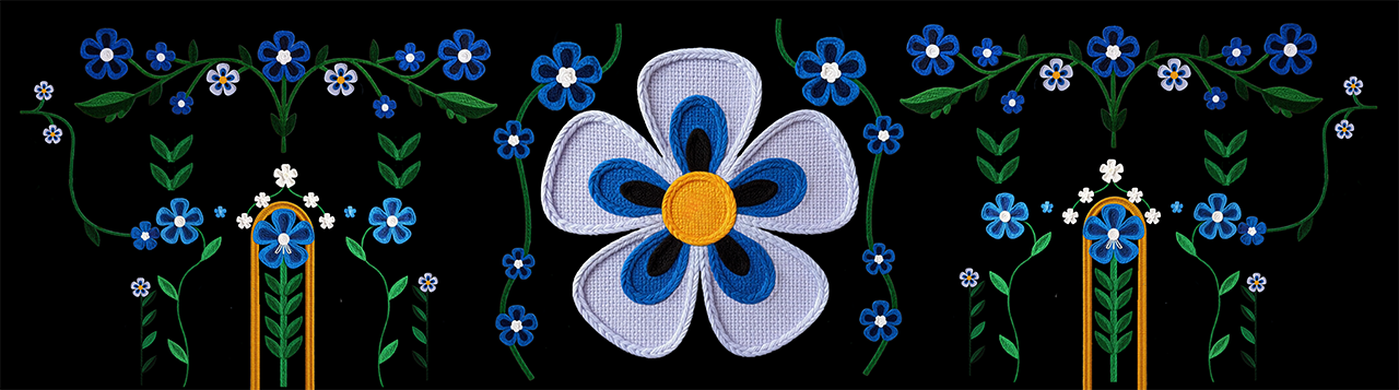
The floral embroidery gradually emerges from the black void, petals unfurling upward, green stems stretching vertically as leaves unfurl symmetrically, maintaining a fixed camera perspective while traditional needlework details materialize into a cohesive botanical arrangement.
There were some pretty good buildup animations in this one, especially the unfurling of the central flower.
Back to WAN 2.2
Seeing the center flower from Luma AI, we tried if we could get a similar result out of start - end frame with local WAN video and the prompt:
Maintaining a fixed camera perspective, the floral embroidery gradually emerges from the black void, petals unfurling one by one.
This convinced us WAN 2.2 was capable enough to generate pieces of our animations.
Of course we would need to be able to composite everything together, having transparency. Using a key in after effects can be enough to accomplish this:
Maintaining a fixed camera perspective, the floral embroidery gradually emerges from the bottom of the red void, petals unfurling one by one
Bringing it all together: designing the start scene
We aimed for a clear textile feel and carried a woven texture throughout the piece. Because this would be projection mapped, we pushed for chunky, high contrast, handmade textures.
We assembled a reference set of about thirty to forty images. Since woven illustration examples are rare, we sourced flat illustrations and restyled them with Nano Banana to achieve a coarse weave look.
Prompt:
Transform the flat illustration into an image with woven texture, thick coarse threads, handmade feeling, weave pattern, depth, different layers, bold, chunky woven texture, not knitted.
Example:
Building the asset set
Next, we blocked out a rough composition for the opening scene, exported each element as a separate image, and processed them with a text-to-image workflow using our trained LoRA to achieve a coarse, layered weave look.
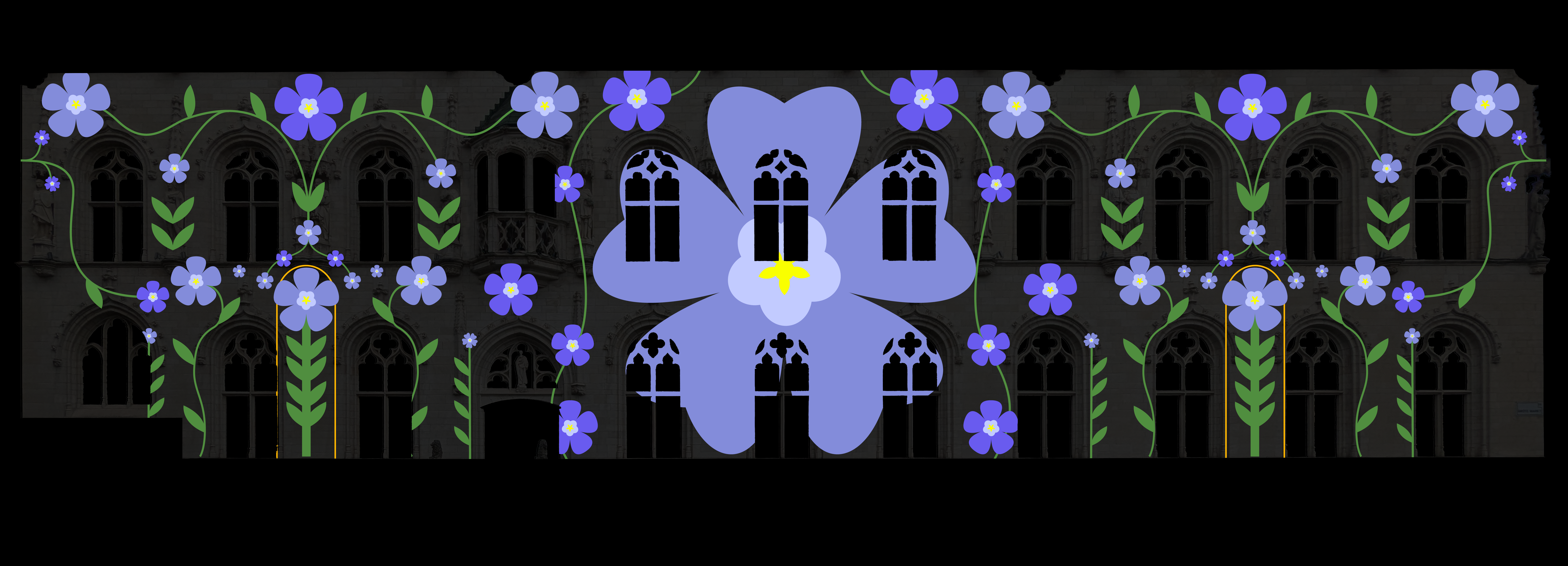
After the model pass, selected images received light color adjustments in Photoshop or with Nano Banana in Google AI Studio, resulting in a cohesive collection of static assets in the same textile style.
These static assets were then fed into the start-to-end workflow, giving us a first set of motion-ready elements for the final piece. To streamline masking in After Effects, each asset was prepared in Photoshop on a clearly contrasting background color so edges could be isolated cleanly.
Video restyling: a woven pattern appears
As a bridge between the “vlaskapel” scene and tapestries falling down the building, we wanted a transition where a woven pattern appears on the building.
We started from a flat input animation, and wanted to see if we could use AI tools to transform that animation into a more tactile representation.
The input animation:
WAN Video Fun Control
We generated an end frame with the qwen_image_woven_fabric_img2img workflow (which uses the qwen lora) to convert a flat-design end frame to a woven fabric, using the prompt:
a blue and white checkered tablecloth on a black background. Hyperrealistic, top-down plain weave fabric. Creamy white warp, vibrant cerulean blue weft, tightly interlaced. Visible yarn texture, subtle shadows, and realistic fiber details against a solid black background. Evokes tactile sensation.
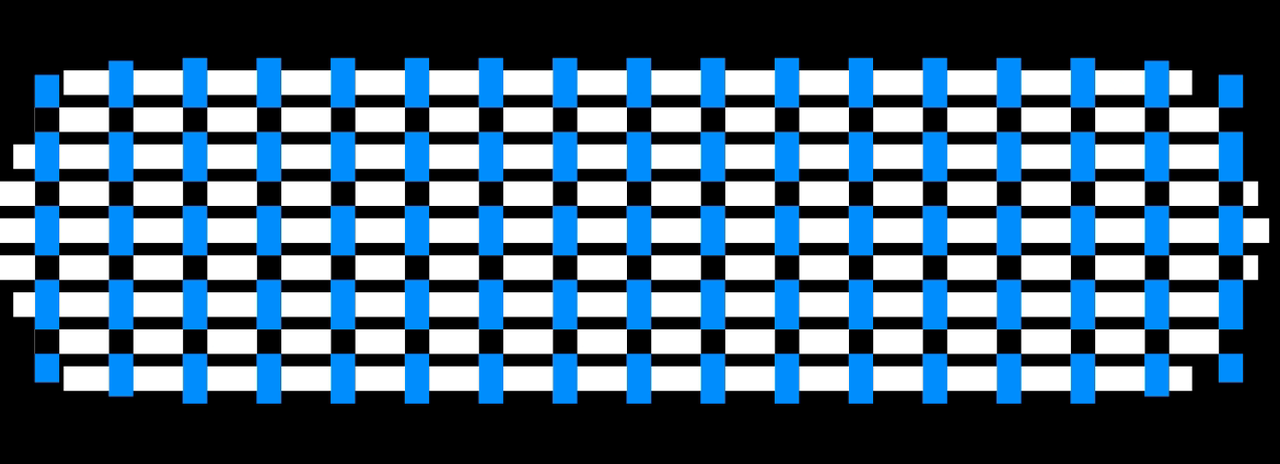
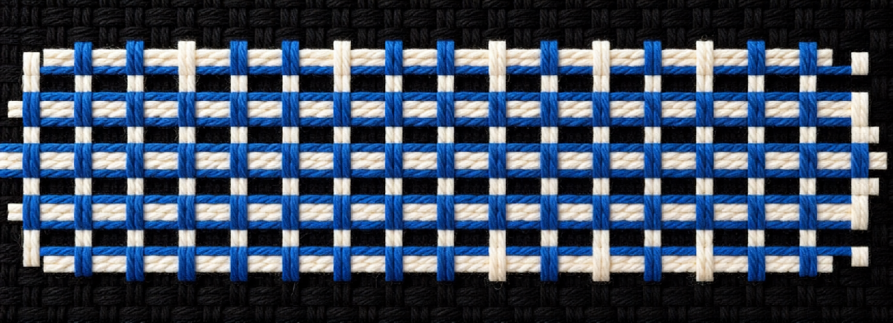
It’s not exactly matching the colors, for that we should try a better qwen image edit LoRA.
Using the wan_video_fun_control_example_03 workflow, we were able to get an animated version. We weren’t been able to decrease the control video strength it seems, so it is sticking quite hard to the input canny edge controlnet:
To receive the workflow file wanvideo_Fun_2_2_control_example_03.json, please consider joining our newsletter.
RunwayML
We also tried RunwayML to see if we could get better quality results.
Using the input animation, with a text prompt:
Transform this video to look like a textile fabric being woven, maintaining the general colors and buildup animation. The background is a plain black matte. The threads should appear as real-life thread and textile fibers, with realistic textures and subtle imperfections of woven fabric.
We got a pretty good result:
Matching colors and texture
For the final version of the woven textile scene, we wanted to use red and white, and more closely match the texture of the previous scene.
We added an additional reference image with the proper colours and texture:
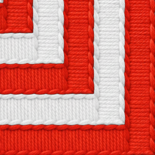
And ran another prompt:
Transform this video to look like a textile fabric being woven, maintaining the general colors and buildup animation. Use the kind of texture of the reference image. The background is a plain black matte. The threads have realistic textures and subtle imperfections of woven fabric. They move above and below each other, interweaving and cause shadows on each other during that proces.
Creating Tapestries
One of our scenes is 5 tapestries rolling down the building. The central piece needs to contain the logo of Kortrijk, while the other 4 need to link to:
Urban Development
Education
Creativity
Industry
Creating one big tapestry
The 5 tapestries need to have similar colours and style. As a first test, we tried creating one big tapestry, based upon an input image:

Nano Banana
We prompted Nano Banana with the above image and the text
Transform this segmented input image into a damask tapestry. The black area should remain fully black. The yellow logo should be the recognizable center piece of the fabric. The blue rectangles are a reference for where I want border-patterns in the damask tapestry. Use golden and red colors for the fabric. Do not use the colors from the input image, as it is a segmented input reference. Show the tapestry from a top view, without any environment.
This gave the following result:
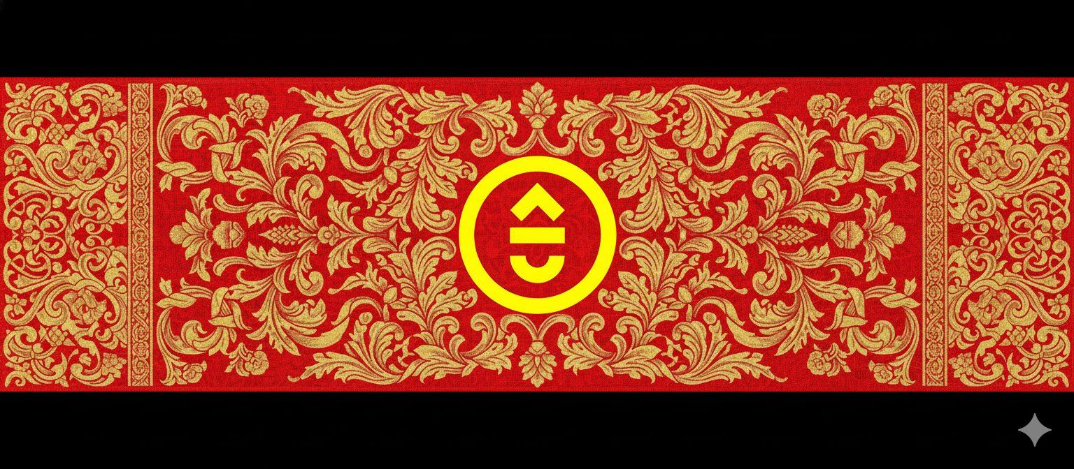
Even with follow up prompts, nano banana wasn’t able to create the tapestries I was looking for..
Qwen Image Edit 2509
We also tried creating the piece using Qwen Image Edit 2509 and the following input image:
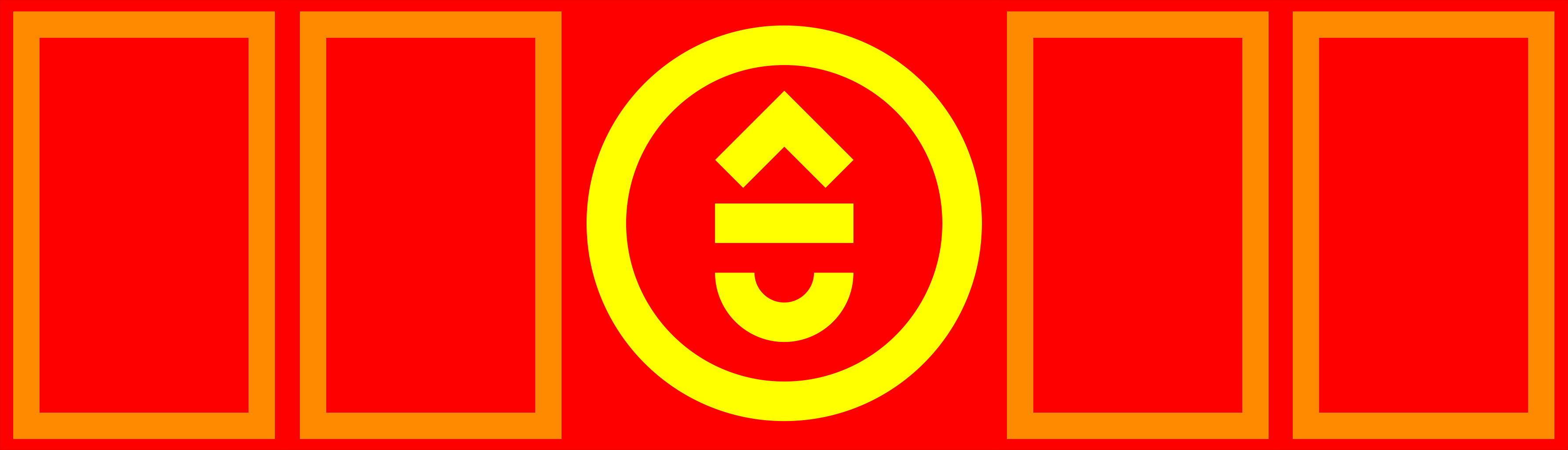
We used the following text prompt:
Transform into 5 distinct damask tapestries using tints of red and gold. Integrate the yellow logo into the central tapestry as a gold colored element. Create damask border patterns instead of the orange rectangles. Show the tapestries from a top view, without any environment
Which resulted in the image below:

Qwen was more capable in following the structure of the input image.
We tried pushing it further, and see if we could get the 4 themes incorporated in the side tapestries.
Transform into 5 distinct damask tapestries using tints of red and gold. Integrate the yellow logo into the central tapestry as a gold colored element. Create damask border patterns instead of the orange rectangles. From left to right: tapestry 1 features a damask wind turbine, tapestry 2 a damask university hat, tapestry 3 the logo in damask style, tapestry 4 a damask industrial building and tapestry 5 a damask light bulb. Show the tapestries from a top view, without any environment
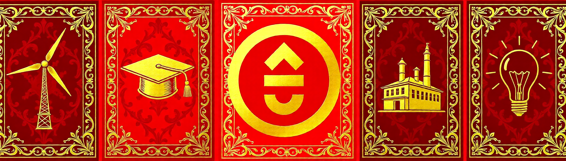
The central graphics look a bit cheap, and we’re lacking detail in the patterns. Part of the reason is the limited resolution Qwen is working on (1MP).
Separate Tapestries
By now, we kind of got that we wouldn’t get to a good result by doing the entire tapestry at once. We decided to create each tapestry on it’s own.
The center piece: Flux Kontext Dev
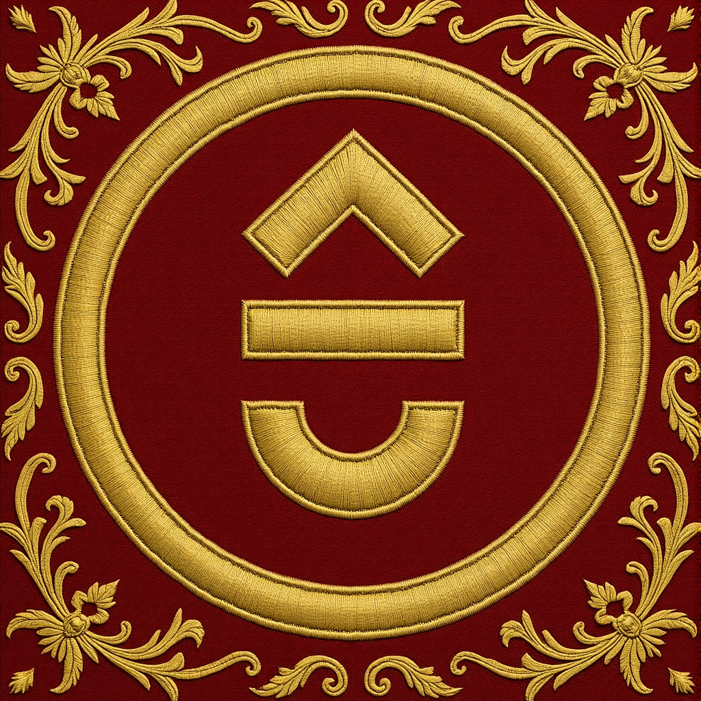
We did have a general color scheme we liked for the tapestries, and decided to create the center piece (the Kortrijk Logo) with Flux Kontext Dev.
Using the prompt transform the logo into the style and colors of the damask fabric while maintaining the scale of the logo. and with both the logo and a tapastry reference image, it was able to create damask fabrics that respected the logo
Reference images:

After a few generations, we settled for this one:
ComfyUI Workflow:
To receive the related workflow file workflow-tapestry-center-logo.json, please consider joining our newsletter.
First side tapestry reference: Flux Kontext
Continuing with Flux Kontext, we created a first tapestry, which should represent the theme “Urban Development”.
After a few tries, we got the following result out of Flux Kontext:
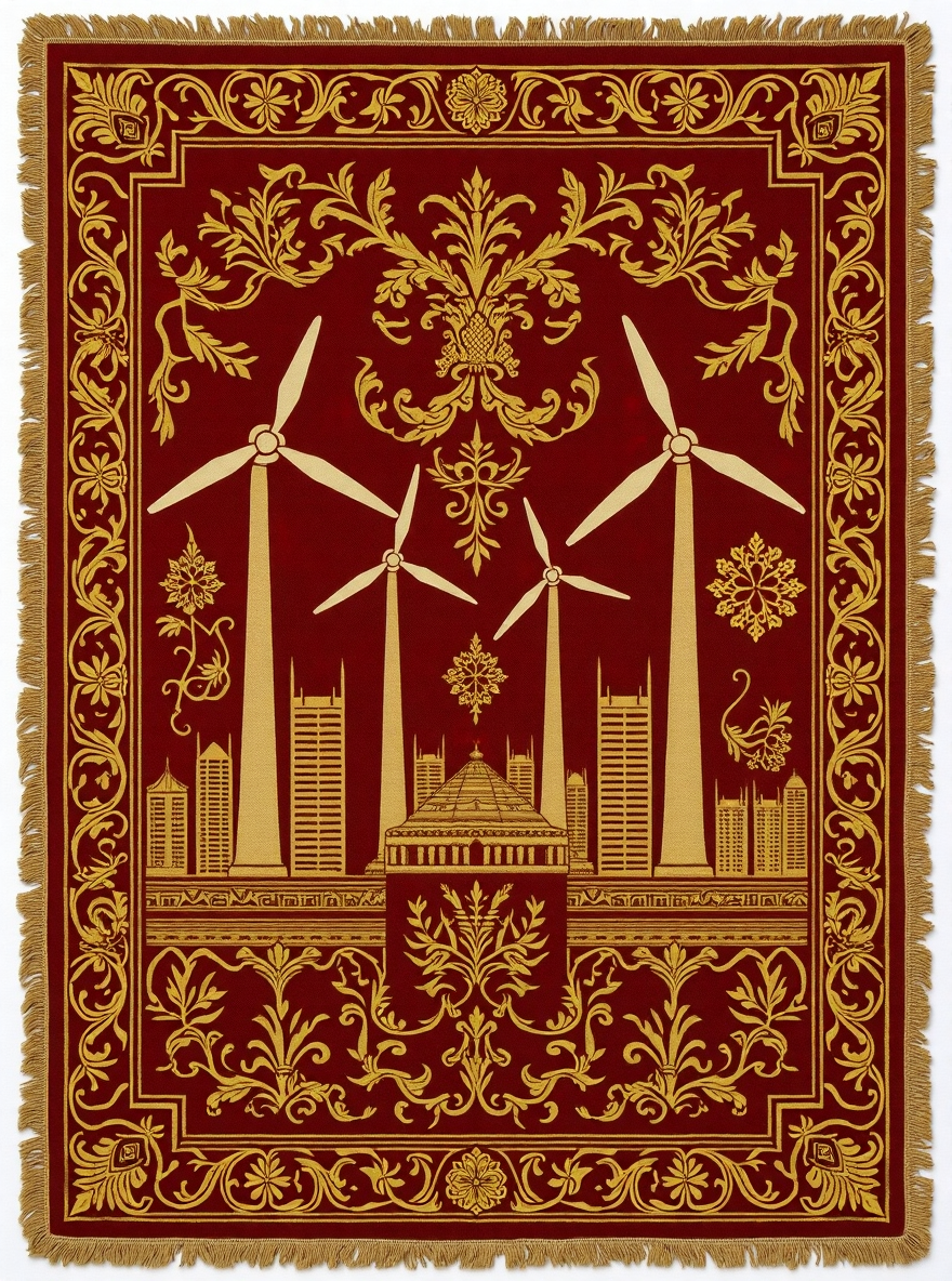
Of course this isn’t the final output yet: there is no link to Kortrijk in those graphics, and the damask decorative elements look a bit “AI”.
However, we can use this one as a reference or basis for the next iteration…
Incorporating Kortrijks landmarks
We want to incorporate some landmarks from Kortrijk that relate to the 4 themes. As a first step, we created simplified black and white illustrations from those landmarks.
For example, for “Urban Development”, we wanted to incorporate the Kollegebrug (a famous bicycle bridge) into the fabric. Using nano-banana, we transformed a photograph into an illustration:

We then moved over to photoshop, with the Astria plugin to start making edits. Passing in the reference image, we ended with 4 tapestries that contained landmarks related to the 4 themes:
Building the 3D tapestry scene
3D Scene in Blender
We aimed to create the illusion of tapestries gracefully falling over the building, and interacting with its architectural features. To achieve this effect, we used the open-source 3D software Blender.
Our process combined cloth simulation to replicate realistic fabric movement with the True Depth plugin, which allowed us to generate a depth map from the building’s pixel map. This approach ensured the digital tapestries would naturally conform to the building’s unique surfaces and dimensions.
Resulting in this depth map that we then used to extrude the building.
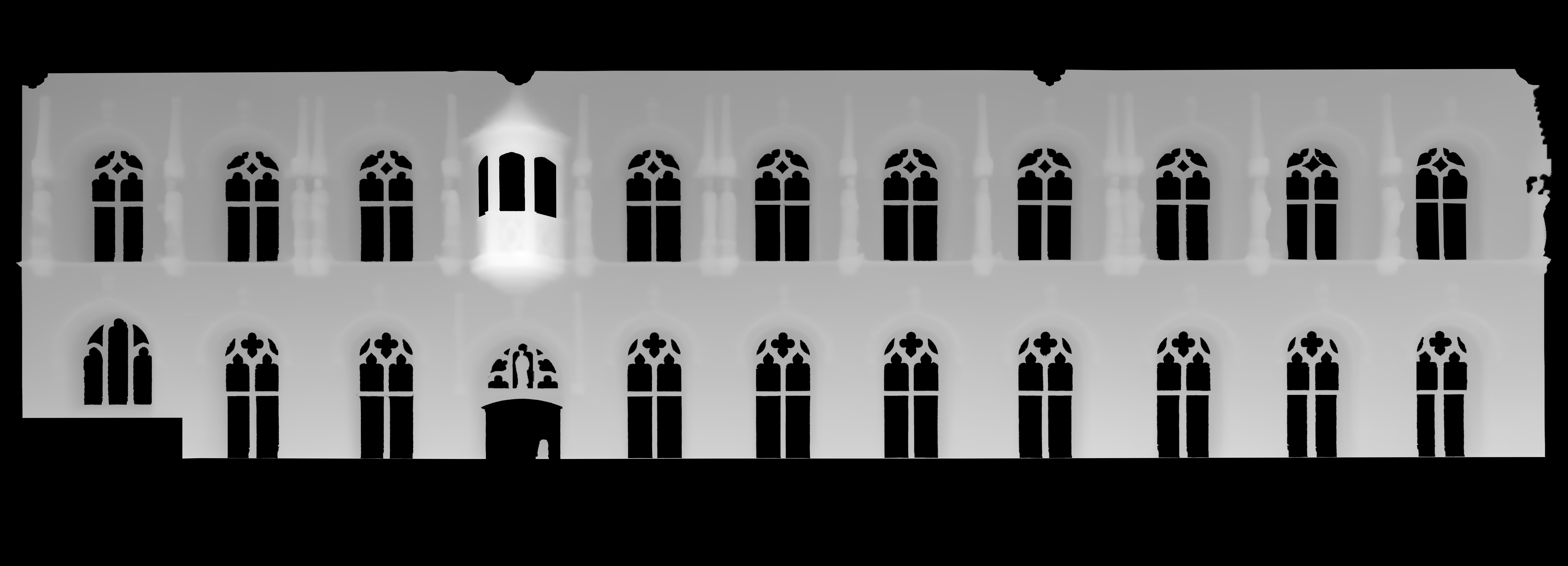
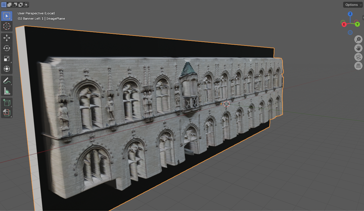
Using this depth map, we enabled the cloth simulation to interact realistically with the building’s architecture, allowing the fabric to drape and respond naturally to its surfaces.
This final sequence brings together all the tapestries unfolding in sequence, timed to the soundtrack to create a conclusion to the projection.
In a next iteration, we planned to animate the tapestry rolling up for a more realistic unfolding effect. However, time constraints prevented us from reworking the animation. During testing, we noticed that the cloth simulation suffered from self-collision, causing the fabric to stick to itself and resulting in slow motion that didn’t fit the edit.
Ultimately, we decided to let the cloth simply fall on its own, which produced a cleaner and more visually appealing result in combination with the soundtrack. While a manual unfolding could have offered more control, it would have sacrificed the realistic interaction with the building’s architecture that the simulation provided.
Texturing
We first cleaned up the tapestries to not have the edge. This gives us a bit more wiggle room in Blender to shift the texture around if needed.
Here you can see the left tapestry has no edit edges and needs to be zoomed in a bit more while the one on the right fits perfectly.
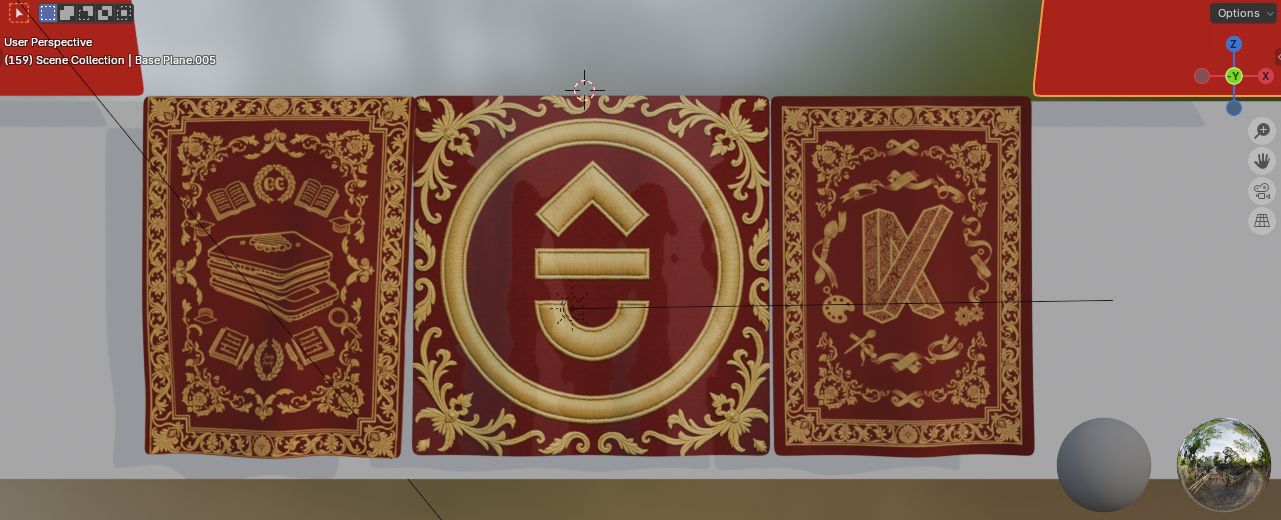
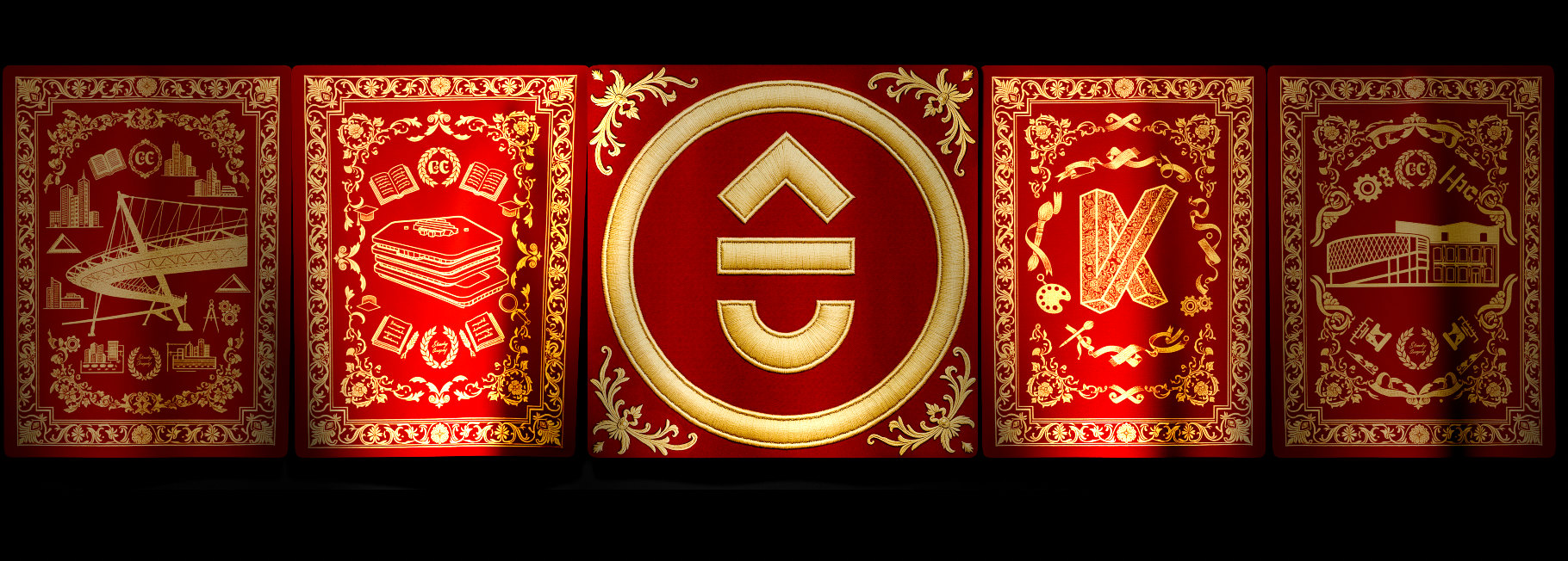
Once all the tapestries where textures correctly, we rendered out this sequence and imported it in after effects. Here we added some lights to create more interest in the edit (timed the lights to specific beats in the music)
Soundtrack
Suno
The support the video mapping we need a soundtrack.
Instead of just randomly selecting music we played with the idea of using the sonic branding of the city of Kortrijk https://www.kortrijk.be/geluid-van-kortrijk
To support the video mapping, we needed a fitting soundtrack. Rather than choosing a random piece of music, we explored the idea of incorporating Kortrijk’s official sonic branding (Geluid van Kortrijk) as the foundation. This provided a meaningful starting point for creating an ambient track tailored to the projection.
Using the cover feature on Suno.com, we experimented with different musical styles and interpretations of the city’s sound identity to shape the mood and rhythm of the piece.
Prompt
Atmospheric soundtrack with sustained choral pads, resonant drones, and evolving strings. Gradual introduction of frame drums and epic percussion leading to a majestic, climactic finale. Purely instrumental, no vocals.
The initial result was a solid starting point but felt too intense for our concept. Fortunately, Suno offers fine control over how much the original track influences new generations. By adjusting the prompt and experimenting with different musical directions, we gradually refined the sound toward our desired mood.
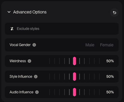
We also combined sections from multiple generations into a new track, which we then re-uploaded to Suno as a fresh baseline for further iterations. This approach gave us greater control over the overall composition, allowing us to shape a clear structure: intro and buildup → dynamic percussive section → further buildup → resolved ending.

Ultimately we ended up using that edit with this prompt:
Atmospheric medieval-inspired soundtrack with sustained choral pads, resonant drones, and evolving strings. Layered with dynamic percussion throughout: subtle frame drums and hand percussion at the start, gradually intensifying into powerful, epic drums and low toms. Medieval timbres such as harp, lute, and hurdy-gurdy weave in texture. The music should steadily evolve toward a majestic, climactic finale.
Final Edit
The initial soundtrack was too long for our target duration of 1–2 minutes. Since Suno didn’t yet have an advanced Editor or Studio feature (now this has been implemented), we used Adobe Audition to trim and refine the audio. We selected the sections that best fit the pacing, bringing the final track to about 1 minute and 20 seconds. To smooth out the abrupt ending, we added reverb to the final note, creating a more natural decay and conclusion.
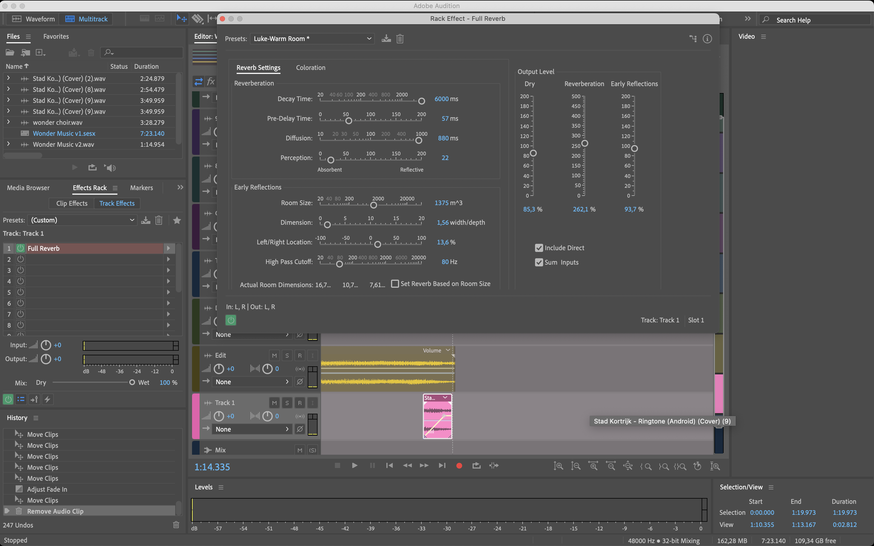
This edit provided plenty of opportunities to create engaging animations, with its strong percussive elements offering clear cues to visualize through the projection mapping.
Brining it all together in After Effects
We used Adobe After Effects to composite all the generated assets and time the edit to the soundtrack.
Compositing the generations
By setting up the ComfyUI workflow with a solid background color, we made it easy to composite assets later by keying out that color and refining the edges with a simple matte choker.
Using time remapping gave us greater control over the animation speed and allowed us to hold the final frame on screen for as long as needed, ensuring smoother pacing and flexibility in the final edit.
With all the generated assets ready, we began populating the scene. As we analyzed how the AI animated each element, new creative ideas started to emerge. We decided to move away from our original composition and instead experimented with how the assets could build upon one another.
This became a nice moment of interplay between the AI’s unexpected contributions and our own vision. Rather than using the generated assets as-is, we shaped and refined them to align with the vision we had for the project.
Final result
More documentation of the final result will follow.